


How to Use PivotTables in Excel

Introduction
If you’ve ever looked at a huge spreadsheet full of data and thought, “How am I supposed to make sense of all this?”, you’re not alone. Analysing raw data can be difficult — especially when you have hundreds or even thousands of rows.
That’s where PivotTables come in.
A PivotTable is one of Excel’s most powerful tools. It lets you summarise, group, and analyse data in just a few clicks — without writing any formulas. With a PivotTable, you can turn a long list of numbers into meaningful insights: totals, averages, counts, comparisons, and trends.
In this article, you’ll learn step by step how to create, customise, and use PivotTables effectively. Whether you’re new to Excel or looking to deepen your skills, this guide will help you make data analysis faster and easier.
What Is a PivotTable?
A PivotTable is an interactive summary table that helps you analyse large amounts of data. It allows you to quickly reorganise (or pivot) your data to see it from different perspectives.
You can use a PivotTable to:
- Total up sales by region or salesperson
- Count the number of orders per product
- Calculate averages, percentages, or running totals
- Compare data over time
The best part? You don’t have to type a single formula.
Step 1: Prepare Your Data
Before creating a PivotTable, make sure your data is organised properly:
- Use column headers: Each column should have a clear title (e.g., “Product”, “Region”, “Sales”).
- Avoid blank rows or columns: Excel treats empty rows as the end of your data.
- Ensure consistency: Numbers should be numbers, dates should be dates, and text should be text.
Example dataset:

Step 2: Insert a PivotTable
- Click anywhere inside your data range.
- Go to the Insert tab on the ribbon.
- Click PivotTable.
- In the dialog box:
- Excel should automatically select your data range.
- Choose whether to place the PivotTable in a new worksheet or an existing one.
- Click OK.
A blank PivotTable appears, and a PivotTable Fields panel opens on the right-hand side of your screen.
Step 3: Build Your PivotTable
The PivotTable Fields pane contains four areas:
- Filters – to limit data shown in the table
- Columns – to display data horizontally across the top
- Rows – to display data vertically down the side
- Values – to show calculations (e.g., sum, average, count)
To build your table:
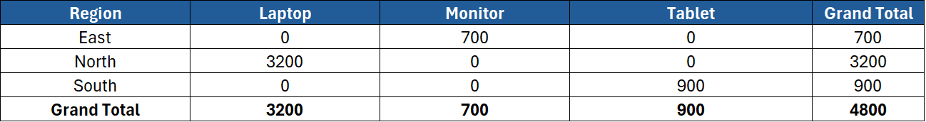
- Drag Region to the Rows area.
- Drag Sales to the Values area.
Excel automatically sums up sales by region, producing a table like this:

Step 4: Add More Fields
You can easily expand your PivotTable by dragging additional fields.
Example:
- Drag Product to the Columns area.
- Now you’ll see sales for each product across regions.
Step 5: Change the Calculation Type
By default, Excel uses Sum for numbers, but you can switch to other calculations:
- Click the small arrow next to Sum of Sales in the Values area.
- Choose Value Field Settings.
- Pick from options such as:
- Count
- Average
- Max / Min
- % of Total
For example, choosing Average gives you the average sales by region instead of the total.
Step 6: Sort and Filter
PivotTables include built-in filters and sorting tools.
- To sort, right-click a value → Sort → choose Largest to Smallest or Smallest to Largest.
- To filter, click the drop-down arrow next to a field label and untick items you don’t want to see.
You can also drag a field (like “Salesperson”) into the Filters area, letting you switch between views easily.
Step 7: Group Data
Grouping helps you simplify long lists or continuous data (like dates or numbers).
Grouping Dates
- Right-click a date in the PivotTable.
- Select Group.
- Choose how you want to group (by Months, Quarters, or Years).
Now you can see monthly or yearly summaries in seconds.
Grouping Numbers
If you have numeric data like “Age” or “Order Quantity”:
- Right-click any number.
- Click Group.
- Enter the Starting, Ending, and By intervals (e.g., group every 10 units).
Step 8: Refreshing the Data
If your source data changes, your PivotTable won’t update automatically.
To refresh it:
- Go to PivotTable Analyze > Refresh, or
- Right-click anywhere in the PivotTable and select Refresh.
You can also refresh all PivotTables at once with Data > Refresh All.
Step 9: Format Your PivotTable
Make your PivotTable easier to read with formatting tools:
- Design Tab – choose from built-in PivotTable Styles.
- Banded Rows – adds alternating colours for better readability.
- Number Formatting – right-click a value → Number Format → select Currency, Percentage, etc.
Tip: Always format numbers using Number Format, not the Home ribbon — that way, the formatting stays even after refreshing data.
Step 10: Add a PivotChart
PivotCharts turn your summary data into visuals.
- Click anywhere inside your PivotTable.
- Go to Insert > PivotChart.
- Choose a chart type (e.g., Column, Pie, Line).
Your chart is linked to the PivotTable, so filtering or changing fields updates it automatically.
Step 11: Create a Slicer
A Slicer provides clickable buttons to filter your data visually.
- Click your PivotTable.
- Go to PivotTable Analyze > Insert Slicer.
- Select the fields you want to filter (e.g., Region, Product).
- Click OK.
Now you can filter your table and chart with a single click — no dropdown menus needed.
Step 12: Common Mistakes to Avoid
- Blank headings: PivotTables can’t use empty column titles.
- Mixed data types: Avoid having both text and numbers in one column.
- Forgetting to refresh: Always refresh after updating source data.
- Overcomplicating: Start simple — one question, one table.
Step 13: Real-World Examples
- Sales Analysis – Summarise sales by region, product, or quarter.
- HR Reporting – Count employees by department or role.
- Customer Support – Track ticket counts by category or agent.
- Finance – Compare expenses by month or account.
- Education – Calculate average test scores by class or subject.
Step 14: Best Practices
- Always use Excel Tables as your data source — they automatically expand when new rows are added.
- Keep your data tidy — one header row, no merged cells.
- Rename PivotTable fields for clarity.
- Combine with Slicers and PivotCharts for interactive dashboards.
- Refresh and save your workbook regularly.
Conclusion
PivotTables turn raw data into meaningful insights quickly and easily. Once you understand how to insert, build, and format them, you’ll be able to summarise complex information in seconds.
This guide covered:
- How to create and customise PivotTables
- Sorting, filtering, and grouping data
- Adding PivotCharts and Slicers
- Tips and best practices for professional reports
With regular use, PivotTables can save you hours of manual work and transform how you analyse data in Excel.
To take your skills to the next level, ExperTrain offers professional Excel courses designed for every experience level:
- Excel Introduction – Learn the basics of Excel, tables, and formatting.
- Excel Intermediate – Build PivotTables, charts, and advanced formulas confidently.
- Excel Advanced – Master data analysis, automation, and reporting.
- Excel Power User – Become an expert with complex functions, Power Query, and data modelling.
With the right training, you’ll go from simple summaries to building powerful interactive dashboards that impress every stakeholder.

