


How to Insert and Format Images in PowerPoint

Introduction
Images can turn an average presentation into a powerful story. A single picture can explain an idea, show a result, or set the mood of a slide. But the secret isn’t just adding pictures — it’s placing and formatting them well so your message is clear.
In this guide, you’ll learn step by step how to insert images, position them, wrap and align them, apply styles and effects, remove backgrounds, reduce file size, and keep everything consistent across your deck. By the end, you’ll be able to build clean, professional slides that look great on any screen.
Step 1: Add Images to Your Slide
PowerPoint gives you several ways to insert pictures. Use the method that fits where your image lives.
A) From your device
- Go to Insert > Pictures > This Device.
- Select one or more images and click Insert.
B) Stock images, icons, and online pictures
- Go to Insert > Pictures > Stock Images (also Online Pictures).
- Search by keyword (for example: “team”, “growth”, “technology”).
- Choose Photos, Illustrations, Icons, or Cutout People and click Insert.
C) Drag-and-drop
You can drag images from File Explorer straight onto a slide. PowerPoint automatically places them on the canvas.
Tip: If your slide layout has a picture placeholder, click the placeholder icon to insert an image that inherits the layout’s sizing and position. This keeps slides consistent.
Step 2: Place and Size Images Precisely
Move
- Click the image to select it, then drag it to the desired position.
- Hold Alt (Windows) while dragging for pixel-fine movement, or use the arrow keys for nudge control (Shift+Arrow for bigger jumps).
Resize
- Drag a corner handle to scale proportionally (recommended).
- Avoid side handles; they stretch the image and distort it.
- For exact values: Picture Format > Size and enter Height or Width. Ensure Lock aspect ratio is on.
Rotate
- Drag the rotation handle above the image, or use Picture Format > Arrange > Rotate for precise degrees.
Pro tip: On widescreen slides (16:9), aim to keep key visuals inside the title-safe area; leave comfortable margins so nothing looks cramped.
Step 3: Align, Distribute, and Snap for Clean Layouts
Consistent alignment instantly makes slides look professional.
- Select one or more images.
- Go to Picture Format > Align:
- Align Left/Center/Right and Top/Middle/Bottom
- Distribute Horizontally/Vertically to even out spacing
- Turn on Guides and Gridlines (View tab) for visual reference.
- Check Snap objects to grid for tidy placement.
Selection Pane: Use Home > Arrange > Selection Pane to rename images (e.g., “Hero Photo”, “Logo”) and reorder complex stacks with ease.
Step 4: Crop and Crop to Shape
Standard crop
- Select the image > Picture Format > Crop.
- Drag the black crop handles to trim edges.
- Click outside the image to finish.
Crop to shape (circle, rounded rectangle, etc.)
- Picture Format > Crop > Crop to Shape.
- Pick a shape; adjust with Crop again if needed.
Aspect ratio crop
- Picture Format > Crop > Aspect Ratio (1:1, 16:9, 4:3, etc.) to enforce a uniform look across slides.
Tip: Use Reset Picture (Picture Format) if you want to revert to the original image.
Step 5: Replace an Image Without Losing Layout
If you want to swap an image but keep size/position:
- Right-click the picture > Change Picture > choose From a File, Stock Images, or Clipboard.
PowerPoint replaces the content and preserves the frame, crop, and effects.
Step 6: Add Picture Styles, Borders, and Shadows
Quickly polish your visuals using built-in styles.
- Picture Styles gallery: Hover to preview frames, reflections, and soft edges.
- Picture Border: Choose Color, Weight, and Dashes for subtle accents.
- Picture Effects: Add Shadow, Glow, Soft Edges, Bevel, or 3-D Rotation.
Best practice: Keep effects subtle. A thin border and a soft drop shadow are usually enough to separate an image from the background without looking heavy.
Step 7: Adjust Brightness, Contrast, and Color
Make a dull photo pop or tone down an overpowering image.
- Corrections: Picture Format > Corrections to adjust Sharpness, Brightness, and Contrast.
- Color: Change Saturation, Tone, or Recolor (e.g., grayscale to push text forward).
- Artistic Effects: Stylise for special slides (blur background, cutout).
Tip: If text competes with a busy image, either:
- Lower Picture Transparency (see Step 9),
- Add a semi-transparent rectangle behind the text, or
- Use Recolor > Washout/Grayscale.
Step 8: Remove Backgrounds Cleanly
To separate a subject from the background:
- Select the image > Picture Format > Remove Background.
- PowerPoint highlights the area to keep in magenta.
- Use Mark Areas to Keep and Mark Areas to Remove to refine.
- Click Keep Changes.
This works well with high-contrast edges (e.g., a person on a simple background).
Step 9: Transparency and Overlays
Subtle transparency helps with text legibility and modern design.
- Picture Format > Transparency to pick a preset or Picture Transparency Options for a custom percentage (often 10–25% is ideal).
- For text overlays, place a rectangle behind your headline, set Fill to a brand color, and reduce Transparency until the text is readable but the image still shows through.
Step 10: Use Image Layouts and SmartArt
To arrange multiple photos quickly:
- Select them > Picture Format > Picture Layout and choose a layout (e.g., grid, captioned, circular).
- Or convert to SmartArt for ready-made compositions with captions.
Note: SmartArt can be converted back to shapes for fine-tuning via Convert > Convert to Shapes.
Step 11: Layer, Group, and Mask
- Order: Right-click an image > Bring to Front / Send to Back to layer above or below other objects.
- Group: Select multiple elements > Ctrl+G to group so they move/resize together.
- Masking with shapes: Insert a shape over an image, select both (image last), then use Shape Format > Merge Shapes > Intersect (works best with icons/SVG; for bitmaps use Crop to Shape).
Step 12: Use the Slide Master for Consistency
For recurring image positions (hero banners, partner logos, team headshots):
- View > Slide Master.
- Add picture placeholders to master layouts.
- Exit Slide Master and use those layouts to keep placement uniform.
This ensures every slide follows the same spacing, margins, and proportions — ideal for brand consistency.
Step 13: File Size and Performance
Large images can make decks slow and hard to share. Optimise them:
- Compress Pictures: Select an image > Picture Format > Compress Pictures.
- Untick “Apply only to this picture” to compress all.
- Choose On-screen (150 ppi) for everyday decks; E-mail (96 ppi) for small files.
- Avoid copy-pasting from screenshots at huge resolutions; resize in an image editor if needed.
- Prefer .JPG for photos; .PNG or .SVG for icons and flat graphics (SVG scales perfectly).
Tip: If you must keep a few hi-res hero images, compress everything else to balance quality and size.
Step 14: Accessibility (Alt Text) and Readability
Make your presentation inclusive:
- Right-click an image > View Alt Text (or Edit Alt Text). Provide a brief description: “Team photo in meeting room” or “Bar chart of quarterly revenue.”
- Ensure text has good contrast against images.
- Avoid decorative images behind lots of text.
Step 15: Animating Images (Light and Tasteful)
Animation should support your story — not distract from it.
- Select image > Animations tab > choose Fade, Wipe, or Fly In.
- Open the Animation Pane to set Start (On Click/With Previous/After Previous) and Timing (Duration/Delay).
- For simple reveals, Morph (Transitions tab) creates smooth movement between slides if the image keeps the same name/layer.
Guideline: Use the same animation style across slides for a consistent feel.
Step 16: Picture as Slide Background
For title or divider slides:
- Right-click the slide > Format Background.
- Choose Picture or texture fill > Insert your image.
- Adjust Transparency or Offset so content remains readable.
Use this sparingly; full-bleed images can look great, but they must not overpower your message.
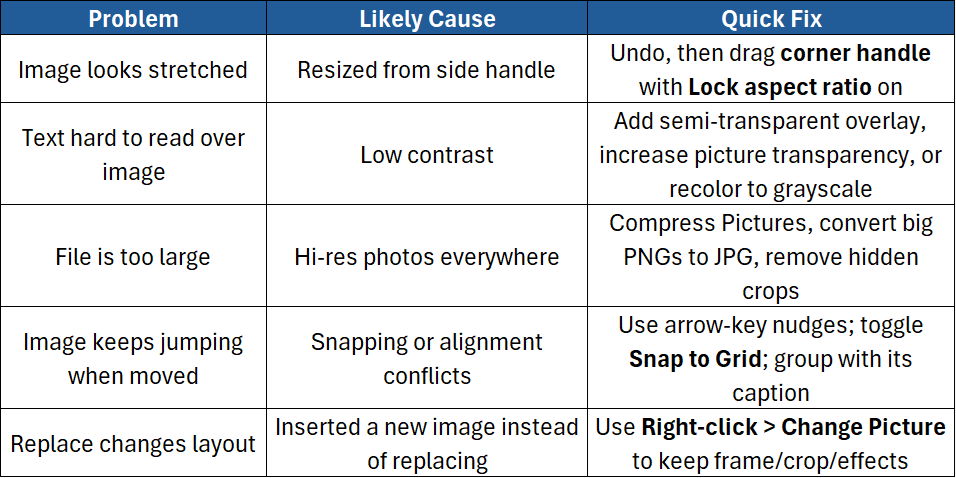
Step 17: Common Problems and Fixes
Step 18: Design Tips for Consistent, On-Brand Slides
- Limit styles: Use 1–2 picture styles across the deck.
- Stick to a color story: Recolor secondary images to grayscale if they clash.
- Use consistent aspect ratios (e.g., all speaker headshots cropped square).
- Mind the edges: Don’t place key content too close to slide borders.
- Less is more: One strong image beats a collage of small ones.
Conclusion
Images can clarify complex ideas, add emotion, and make your story stick. With the tools in PowerPoint — cropping, transparency, background removal, alignment, and compression — you can build slides that look clean and professional without needing a separate design app.
In this guide, you learned how to:
- Insert images from different sources
- Place, size, align, and distribute them
- Crop to shapes and set aspect ratios
- Apply styles, shadows, and color corrections
- Remove backgrounds and add transparency
- Keep file sizes manageable and slides accessible
If you want hands-on practice and pro tips from expert trainers, check out our PowerPoint courses:
- PowerPoint Introduction – Build confident skills with layouts, text boxes, images, and basic design.
- PowerPoint Advanced – Master advanced formatting, animation, slide masters, and on-brand visual systems.

