


.svg)
How to Create Your First Canvas App in Power Apps

Introduction
Do you have a process that lives in spreadsheets and emails? Maybe a form people fill in and send to you, or a list you update by hand. Microsoft Power Apps helps you turn that work into a simple app you can run on the web or phone. You won’t need to write code, just use drag-and-drop tools and Excel-style formulas.
In this guide, you’ll build a small Canvas app step by step. You’ll learn how to prepare data, connect to it, design screens, add forms and galleries, write a few useful formulas, and share your app. We’ll keep things practical and simple, so you can go from zero to a working app in one sitting.
What is a Canvas App?
A Canvas app is a free-form app you design like a slide. You place controls (buttons, text inputs, forms, galleries, icons) wherever you want and hook them to your data. Power Apps connects to hundreds of data sources, including SharePoint, OneDrive/Excel, Dataverse, Teams, Outlook, SQL, and many more.
Canvas apps are ideal when:
- You want a custom layout (desktop or mobile).
- You need a quick tool for a team process (requests, inspections, approvals).
- You want to start small and grow later.
Before You Start: Plan a Tiny but Useful Scenario
Pick a small process you understand well. For a first app, try an Issue Tracker:
- People log an issue (Title, Description, Priority, Status, Due Date, Assigned To).
- You can view a list of issues, add new ones, and update status to “Resolved”.
- The data sits in a SharePoint list (reliable and easy for multiple users).
Why SharePoint first? It’s simple to secure, supports multiple users, and is delegation-friendly for filters and searches.
Step 1 — Prepare Your Data (SharePoint List)
Create a SharePoint List called Issues with these columns:
- Title — Single line of text (Required)
- Description — Multiple lines of text
- Priority — Choice (Low, Medium, High)
- Status — Choice (New, In Progress, Resolved)
- AssignedTo — Person
- DueDate — Date and Time
Add two or three sample rows so your app shows real data during build.
Tip: Keep column names short (no trailing spaces). Good names make formulas cleaner.
Step 2 — Start a New Canvas App
- Go to make.powerapps.com and sign in.
- Select Create > Canvas app from blank.
- Choose Tablet (wider) or Phone (tall). Tablet is easier for first builds.
- Name it Issue Tracker App and click Create.
You’re now in Power Apps Studio with a blank app and a single screen.
Step 3 — Connect to Your Data
- In the left panel, click Data (database icon).
- Add data → search SharePoint → connect to your site.
- Pick the Issues list.
Power Apps adds the connection. You can now read and write data.
Step 4 — Build the Browse Screen (List of Issues)
We’ll create a simple list with search and filters.
- Insert > Gallery > Vertical. Place it on the screen.
- Set the gallery’s Items property to:
SortByColumns(
    Filter(
        Issues,
        If(
            IsBlank(SearchBox.Text),
            true,
            StartsWith(Title, SearchBox.Text)
        )
        && If(
            PriorityFilter.Selected.Value = "All" || IsBlank(PriorityFilter.Selected.Value),
            true,
            Priority = PriorityFilter.Selected.Value
        )
    ),
    "Created",
    Descending
)
- Above the gallery, Insert > Text input; rename it SearchBox and set HintText to “Search issues…”.
- Next to it, Insert > Dropdown; rename it PriorityFilter.
- Items:
Table(
    {Value:"All"},
    {Value:"Low"},
    {Value:"Medium"},
    {Value:"High"}
)- Default:
"All"
- Inside the gallery template, show Title, Priority, Status, and DueDate.
- Add a + New Button at the top right. Set OnSelect:
NewForm(EditForm1);
Navigate(EditScreen, ScreenTransition.Fade)
This gives you a searchable, filterable list that sorts latest issues to the top.
Step 5 — Build the Edit Screen (Add / Update)
- Insert > Edit form. Set DataSource to Issues.
- In the right pane, select these fields: Title, Description, Priority, Status, AssignedTo, DueDate.
- Add a Save Button: OnSelect →
SubmitForm(EditForm1) - Add a Cancel Button: OnSelect →
ResetForm(EditForm1);
Back()
- Set the form’s Item property to the selected record from the gallery:
BrowseGallery1.Selected
- To open an item for editing when a user taps it in the gallery:
// Gallery 'OnSelect'
EditForm(EditForm1);
Navigate(EditScreen, ScreenTransition.Fade)
- Make Title required in the SharePoint list so the form enforces it automatically.
Step 6 — Quick Actions (Resolve / Delete with Confirmation)
Resolve directly from the list:
- In the gallery template, Insert > Icon > Check.
- Icon OnSelect:
Patch(
    Issues,
    ThisItem,
    { Status: "Resolved" }
);
Notify("Issue marked as Resolved", NotificationType.Success)
Delete from the edit screen with a simple confirmation panel:
- Add a variable in the Delete icon OnSelect:
UpdateContext({showConfirm:true})
- Insert a semi-transparent Rectangle and a small Container with “Delete?” and Yes/No buttons; set the container’s Visible to
showConfirm. - Yes button OnSelect:
Remove(Issues, EditForm1.LastSubmit);
UpdateContext({showConfirm:false});
Back();
Notify("Issue deleted", NotificationType.Success)
- No button OnSelect:
UpdateContext({showConfirm:false})
Step 7 — Validation and Helpful Messages
- Disable Save until the form is valid: set Save button DisplayMode to:
If(EditForm1.Valid, DisplayMode.Edit, DisplayMode.Disabled)
- Show a toast when a record is saved: select the Form, open OnSuccess, and add:
Notify(
    If(EditForm1.Mode = FormMode.New, "Issue created", "Issue updated"),
    NotificationType.Success
);
Back()
- Handle submit errors: OnFailure:
Notify("Could not save. Check required fields or try again.", NotificationType.Error)
Step 8 — Make It Look Good (Layout & Styling)
- Use Containers: Insert > Layout > Horizontal/Vertical container to keep items aligned and responsive.
- Spacing: Give controls padding (8–16 px) and consistent gaps (16–24 px).
- Theme Colours: Stick to your brand primaries and neutrals; avoid rainbow palettes.
- Icons + Labels: Pair a small icon with a short label (“New”, “Save”, “Resolve”) for clarity.
- Set Default Shape/Text: Right-click a styled control → Set as default to reuse its look.
Step 9 — Make It Responsive (Works on Web and Mobile)
- In App settings > Screen size + orientation, consider turning Scale to fit off for full control.
- Use relative sizes:
- Left column width:
Parent.Width * 0.35 - Right column width:
Parent.Width * 0.65
- Left column width:
- For side-by-side fields on larger screens and stacked fields on mobile, wrap controls in a responsive Container and switch the Layout or X/Y/Width formulas using
If(App.Width > 900, …).
Step 10 — Search, Sort and Filter Patterns You’ll Use Everywhere
- StartsWith for fast, delegable text search (SharePoint, Dataverse).
- Chained filters using
Withfor readability:
With(
    {
        q: SearchBox.Text,
        pr: PriorityFilter.Selected.Value
    },
    SortByColumns(
        Filter(
            Issues,
            (IsBlank(q) || StartsWith(Title, q))
            && (pr = "All" || Priority = pr)
        ),
        "Created",
        Descending
    )
)
- Flexible sorting with a toggle:
// OnSelect of a sort icon
Set(varSortDesc, !varSortDesc);

// In Items
SortByColumns(
   <your Filter(...)>,
   "Created",
   If(varSortDesc, Descending, Ascending)
)
Step 11 — Performance Tips (Keep It Snappy)
- Delegate where possible: use
Filter,Sort,StartsWithon SharePoint/Dataverse columns that are indexed. - Limit controls per screen; too many controls slow rendering.
- Pre-load small choice lists on App.OnStart:
ClearCollect(colPriority, Choices(Issues.Priority));
ClearCollect(colStatus, Choices(Issues.Status));
- Avoid repeated calls: If you need user info across screens, store it once:
Set(CurrentUser, User()).
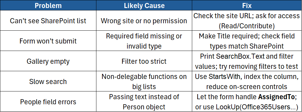
Step 12 — Errors and Troubleshooting
Step 13 — Sharing, Permissions and Roles
- Share the app: File > Share → add people or a group → Can use or Can edit.
- Share the data: Give users access to the Issues list (read/edit as needed).
- Have at least two owners for continuity.
- If you need to deploy across environments, look into Solutions and Environment variables later.
Step 14 — Nice Extras (Optional Upgrades)
- Attachments: In the Edit Form, enable the Attachments card so users can upload photos/files.
- User defaults: Prefill AssignedTo with current user on new records:
If(
   EditForm1.Mode = FormMode.New,
   { '@odata.type':"#Microsoft.Azure.Connectors.SharePoint.SPListExpandedUser",
     Claims:"i:0#.f|membership|" & Lower(User().Email),
     DisplayName: User().FullName,
     Email: User().Email
   },
   ThisItem.AssignedTo
)
- Export to Excel: Add a Power Automate flow button to export filtered results (handy for managers).
- Role-based views: Hide admin buttons unless the user is an owner:
If(User().Email in colOwners.Email, true, false)
Step 15 — Test and Publish
- Use Play to test add/edit/delete flows.
- Try edge cases (blank Title, long Description, no network).
- Save the app and Publish (File > Save > Publish).
- Share the link with your team and gather feedback.
Best-Practice Checklist (Copy/Paste)
- ✅ Keep names short and clear (screens, controls, variables).
- ✅ Use StartsWith and Filter on indexed columns for speed.
- ✅ Store repeated values in variables/collections once.
- ✅ Add Notify messages for success and errors.
- ✅ Provide a simple Welcome or Help screen.
- ✅ Share the app and the data; add a backup owner.
- ✅ Review the app monthly; remove unused controls and screens.
Conclusion
You’ve just built your first Canvas app: a practical Issue Tracker with list, search, add, edit, resolve, and delete. You learned how to connect to SharePoint, design screens, write a few Power Fx formulas, and share your app. From here, you can add approvals, dashboards, or move to Dataverse for advanced security and relationships.
If you’d like instructor-led guidance, patterns, and hands-on tips from experts, join our course:
- Microsoft Power Apps Introduction – Build your first canvas app, connect to data, write core formulas, add forms and galleries, handle errors, and publish with confidence.


.png)